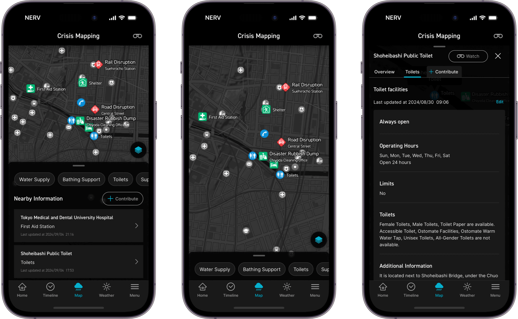
The Crisis Mapping layer visualises essential disaster relief info on a map, empowering communities to rebuild together by helping users share crucial information, like shelter locations, water supply points, toilet facilities, road conditions, disaster waste collection points, disaster certificate application locations and relief supply points.
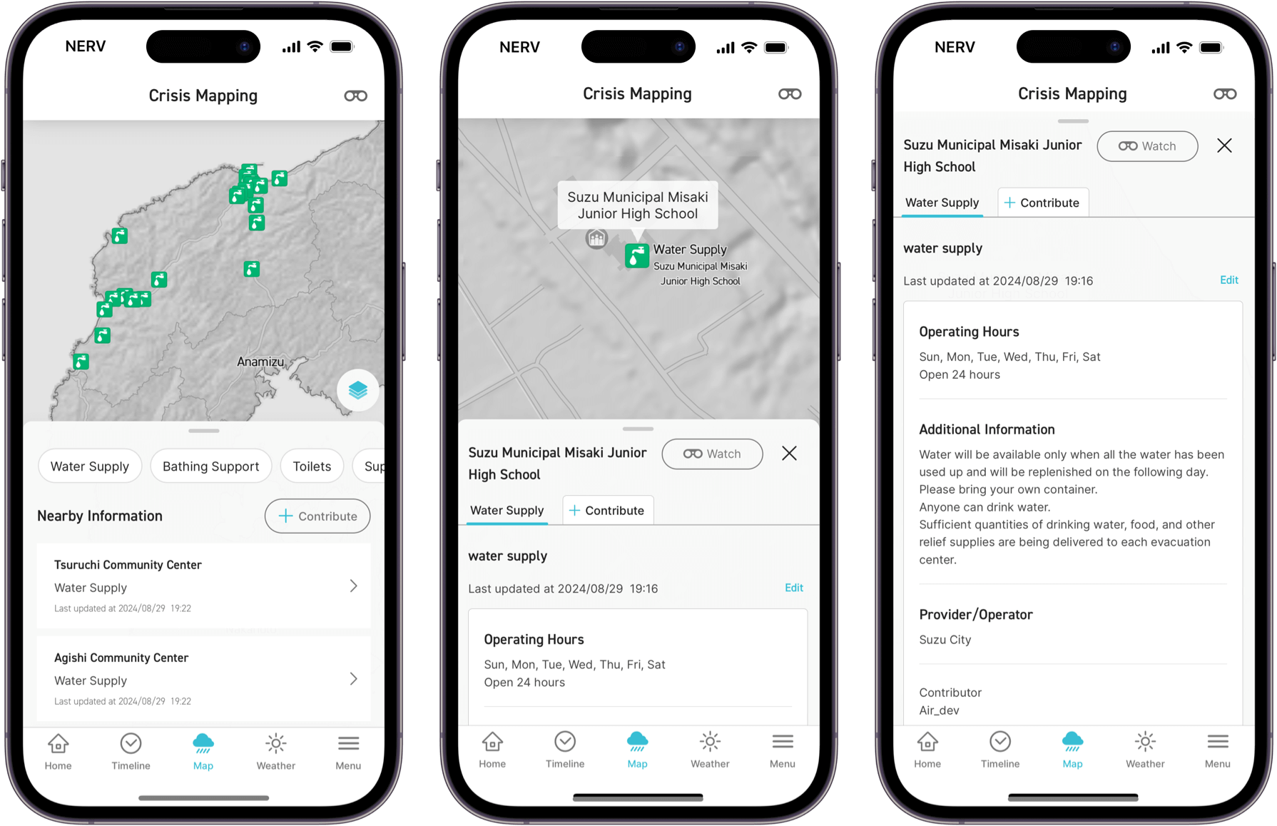
※ Sample image. Actual information may differ.
Supporters' Club members can post information within a 10km radius of their current location and add detailed explanations where necessary. Incorrect or outdated information can be reviewed by Gehirn and corrected or deleted by fellow supporters.
Japanese posts are automatically translated into English and vice-versa, facilitating information sharing beyond language barriers, aiding international disaster support, and ensuring the safety of foreign residents and visitors to Japan.
Using the "Watch" feature, you can be notified when information on pre-specified points has been updated or changed. This feature can be used to keep track of updates to support information near you or the status of information you have posted.
Since the Great East Japan Earthquake, the Internet and social media have gained attention as new means of information dissemination. With the rise of smartphones and frequent natural disasters in Japan, many public agencies and media outlets began using social media to publish disaster information. However, the recent shift in social media platforms has led to an explosion of posts aimed at generating impressions or revenue, contaminating the information space and making it difficult to find accurate information. Even for public institutions, challenges such as data format inconsistencies and operational issues have also hindered the effective use of these platforms for seeking information.
In response to this, the team behind the NERV Disaster Prevention App have created a data format specifically for disaster and support information, using Crisis Mapping as a tool to collect and share that information. This project is quite experimental, and the impact of this project on society and how useful or valuable it will be is still unknown to us. There is a possibility that it may not work as intended, but we hope that our network of users can change the way information is communicated.
※ Sample image. Actual information may differ.
Crisis Mapping is only just getting started, and most of the information currently is incomplete. A strong user network is essential for creating high-quality information. We hope that you can map nearby toilets, parks, public facilities, etc., in your area on a regular basis in order to help those around you access essential information in the event of a disaster. Toilet information is particularly important for those who need to know if facilities are accessible or ostomate-friendly (for individuals using a stoma, an artificial opening in the abdomen for waste discharge, such as a colostomy or urostomy).
Just as the app has continued to evolve over the past 5 years, we would be grateful if you could help us grow the still-developing Crisis Mapping layer with us over the years to come.
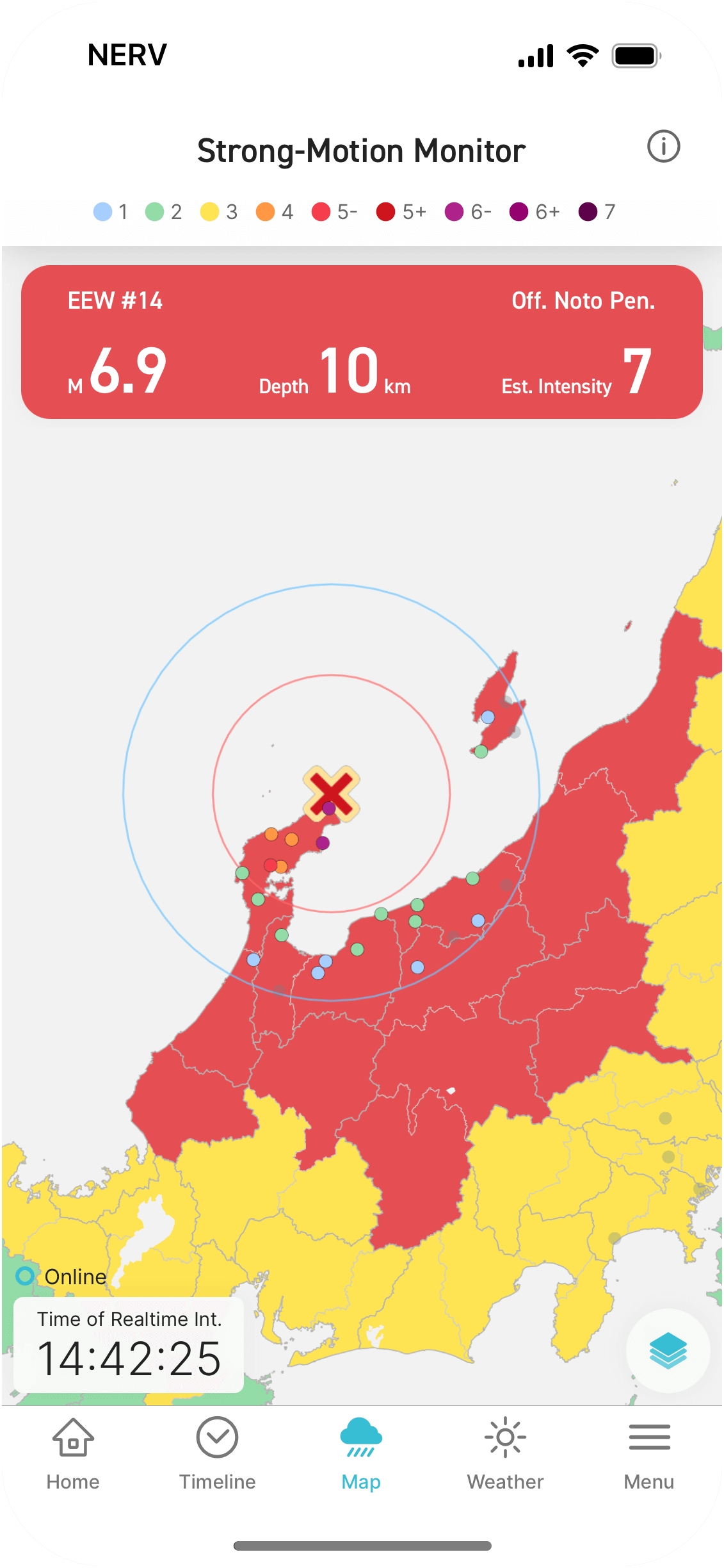
The Strong-Motion Monitor layer is a feature that displays the real-time shaking situation throughout Japan, as observed by the Strong-Motion Observation Network (a network of seismometers for recording strong shaking), operated by the National Research Institute for Earth Science and Disaster Resilience (NIED). When an Earthquake Early Warning (Forecast) is issued, the Strong-Motion Monitor layer automatically integrates and displays the information from the EEW, including the forecasted Seismic Intensity distribution, and estimated propagation of the P and S waves along side the Strong-Motion data.
If you enable Shaking Detection Notifications, you can receive Push Notifications when shaking from an earthquake is believed to have been detected. In some cases, it is possible to detect and be notified about earthquakes for which no Earthquake Early Warning has been issued. Please note that the detection method is not perfect, and notifications may be sent due to false positives.
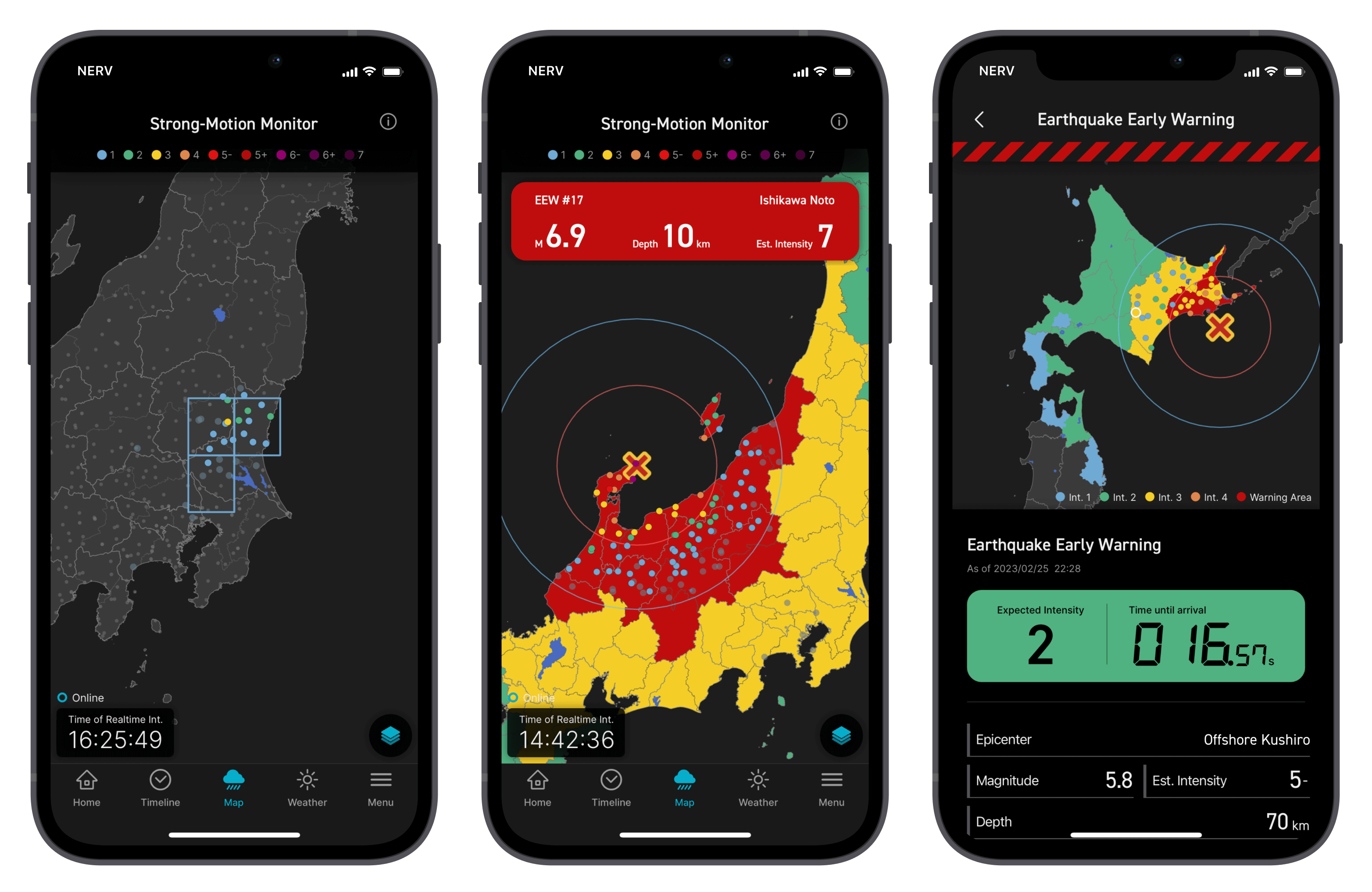
The Strong-Motion Monitor layer has been experimentally worked on since February 2023 based on the "Joint Research Implementation Plan for the Utilisation of Strong-Motion Monitor Data" which was established by four parties: the National Research Institute for Earth Science and Disaster Resilience (NIED), Gehirn Inc., TBS Television Inc., and TBS / JNN NEWS DIG LLC. This service has been made available to the general public through the "Mutual Cooperation Agreement for the Utilisation of Strong-Motion Monitor Data". Gehirn Inc. processes and distributes the information received from a dedicated communications line installed at NIED. This dedicated line uses a redundant configuration to ensure a fast and reliable service for the NERV Disaster Prevention app. Please note that this is a separate service from the "Strong-Motion Monitor" web service provided by NIED.
Tailor the app’s interface to your own preference.
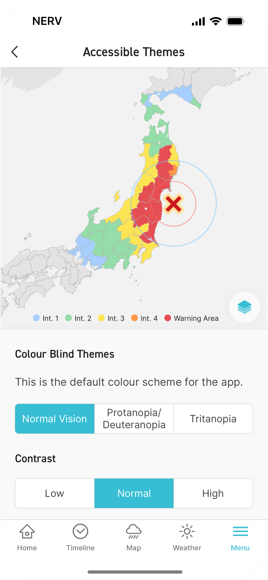
Choose a colour scheme that’s optimised for colour vision deficiency/colour blindness※1, change the contrast to suit visual sensitivity※2 and low vision, adjust the text size and thickness, or even make use of VoiceOver, throughout the app.
※ 1. Colour vision deficiency can be a group of eye conditions in which the photoreceptor cells (cone cells) that identify colours, recognise and discriminate differently from the majority. There are three types: Standard colour vision, Deuteranopia/Protanopia (red/green colour deficiency), Tritanopia (blue/yellow colour deficiency), and Monochromacy (achromatopsia/complete colour deficiency).
※ 2. Visual hypersensitivity is a sensory sensitivity of the eyes to brightness and colour. Symptoms include difficulty keeping the eyes open due to glare from the sun, and inability to look directly at certain colours or combinations of colours, such as primary colours.
We’ve been working on the topic of information accessibility for the past several years. By accessibility, we mean that everyone should be able to access information in a means and format that suits them.
In addition to these people, this update includes functions that can be customised for each user in pursuit of "ease of viewing" for people with colour vision deficiency, far-sightedness, total blindness, and various visual difficulties such as presbyopia, cataracts, and glaucoma.
We’ve been looking for ways to convey information that do not rely on only one of each of the three senses: colour, sight, and hearing. We have taken the utmost care to convey information not only by colour, but also by text, and not only by text, but also by sound.
Language barriers are another accessibility issue, and for the 2021 update, we worked on English language support to make information accessible to more people. For 2022, we are working to make visual, colour, and auditory communication even more accessible.
In addition to the existing dark theme-based interface, a new light theme-based design can now be enabled. We aimed to create a colour scheme that is highly visible, fresh, and beautiful. In addition to redesigning the colour scheme for every screen in the app, we reimplemented every component to work with the new themes, including the map system, image generation engine, and widgets.
Colour schemes optimised for each colour vision deficiency type can be selected: "Normal Vision" which is the general colour vision compatible with most people; "Protanopia/Deuteranopia," in which red and green are difficult to distinguish; and "Tritanopia" in which blue and yellow are difficult to distinguish.
Contrast can be selected from "low," "normal," and "high. When set to "low", the display is less stimulating and pale, while when set to "high", frames and text are more clearly displayed.
You’re now also able to adjust the font size and font weight. Font size can be made 2 levels smaller than standard, and 4 levels larger. Font weight can be selected from "normal," "medium," and "bold”. By adjusting the font size and thickness to your preference, the weather information and weather summary screens will be easier to read than ever before.
For users using VoiceOver or TalkBack, you can now enable a layout that is more optimised for screen-reader usage. When this feature is turned on, the map in the application is omitted and the layout is changed to one that is easier to touch with a screen reader. The user interface has also been updated to include more accessible read-outs.
For example, when you tap the weather card on the home screen, it will read, "It's currently sunny, 23.9 degrees, recorded 0.0mm of precipitation in the past hour, 30% humidity"; when the weather forecast tab is displayed, it will read, "Today's forecast is cloudy with some rain," and "Forecast high of 26 (3 degrees lower than yesterday), and a low of 21, (same as yesterday)".
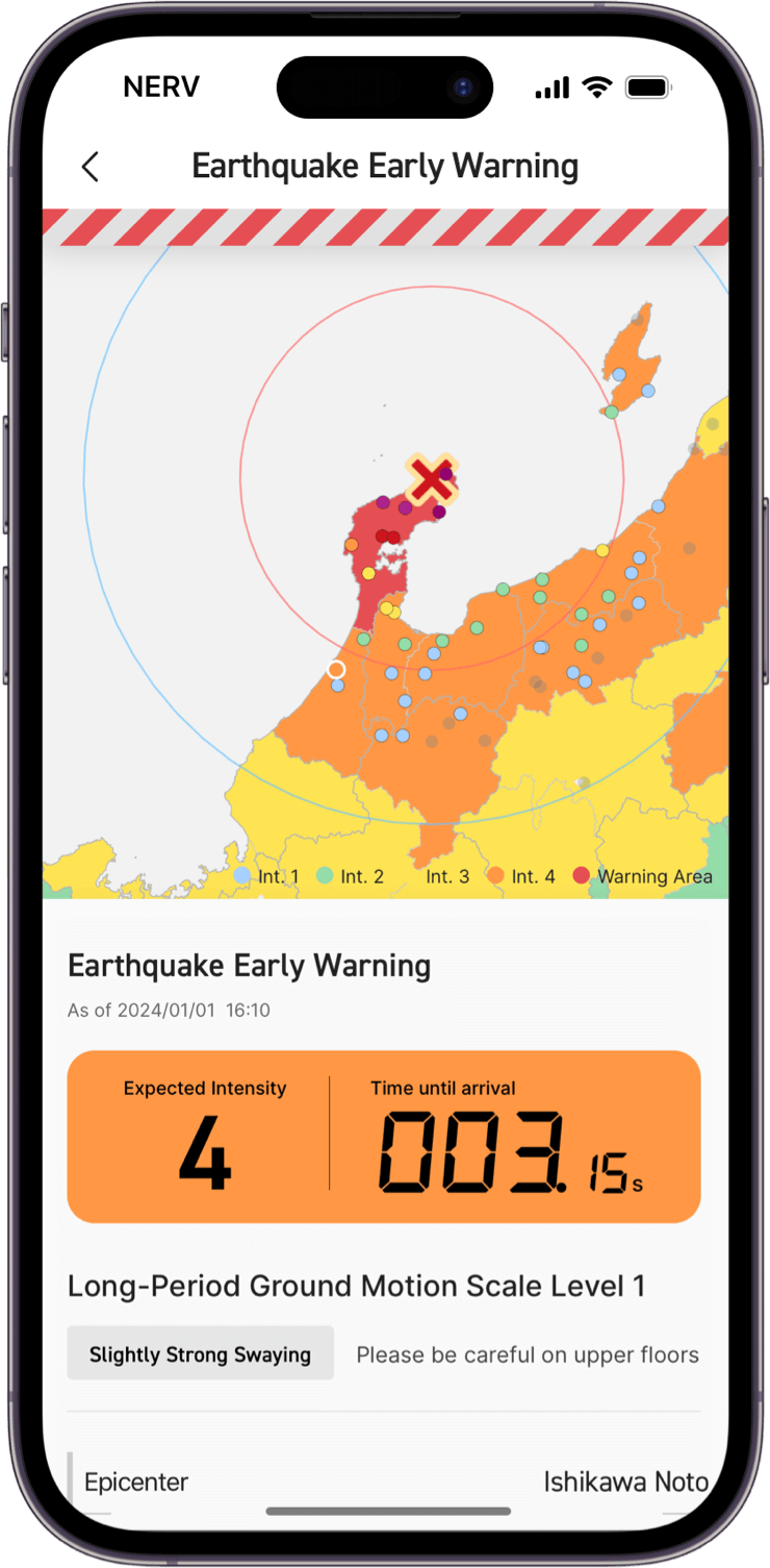
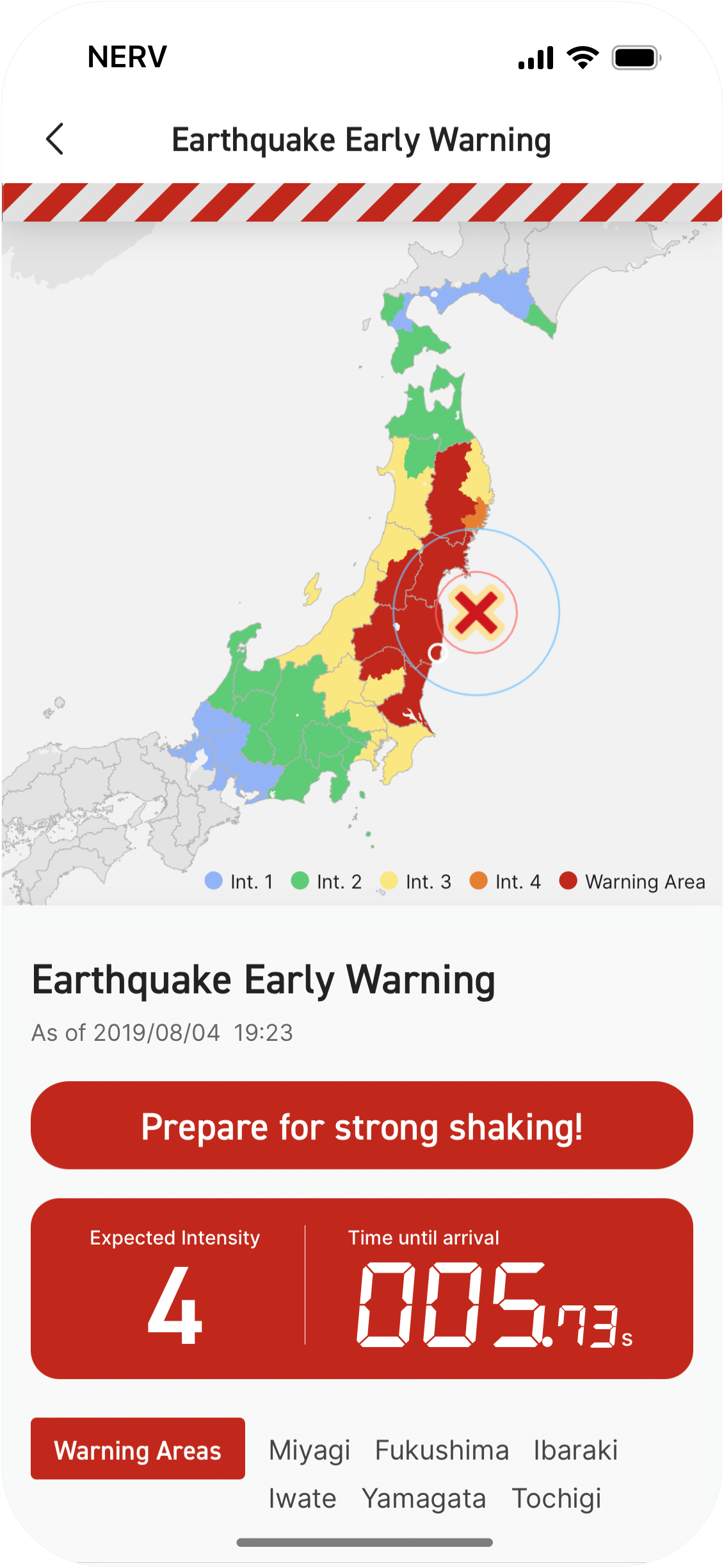
Earthquake Early Warning and Real-Time Seismic Intensity are integrated to display the predicted seismic intensity and countdown to the arrival of the S-wave at your current location.
If multiple Earthquake Early Warnings are issued for your location, all reports are automatically integrated and displayed together.
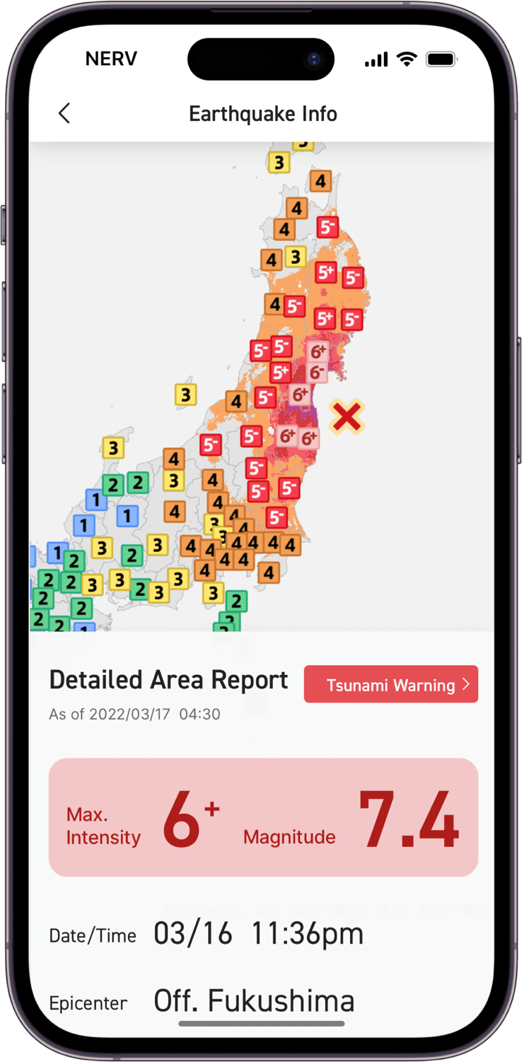
Seismic Intensity Flash Reports (Int. 3 and higher), Epicenter Information (magnitude, depth, and hypocenter location), Detailed Area Reports (Int. 1 and higher, magnitude, depth, and hypocenter location), and Estimated Seismic Intensity Distribution Maps (hyperlocal seismic intensity distribution based on computed models) are supported and update in real-time as subsequent information is issued.
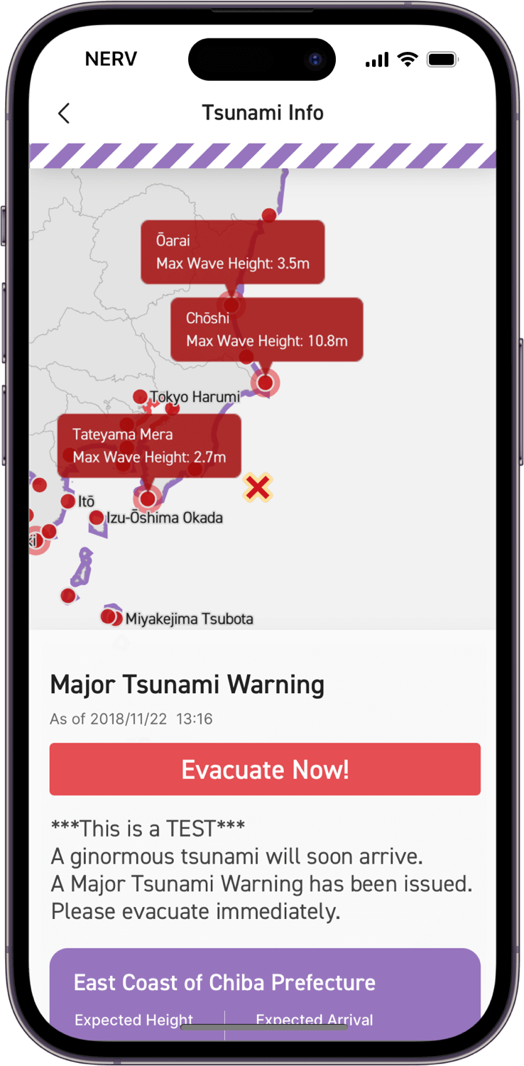
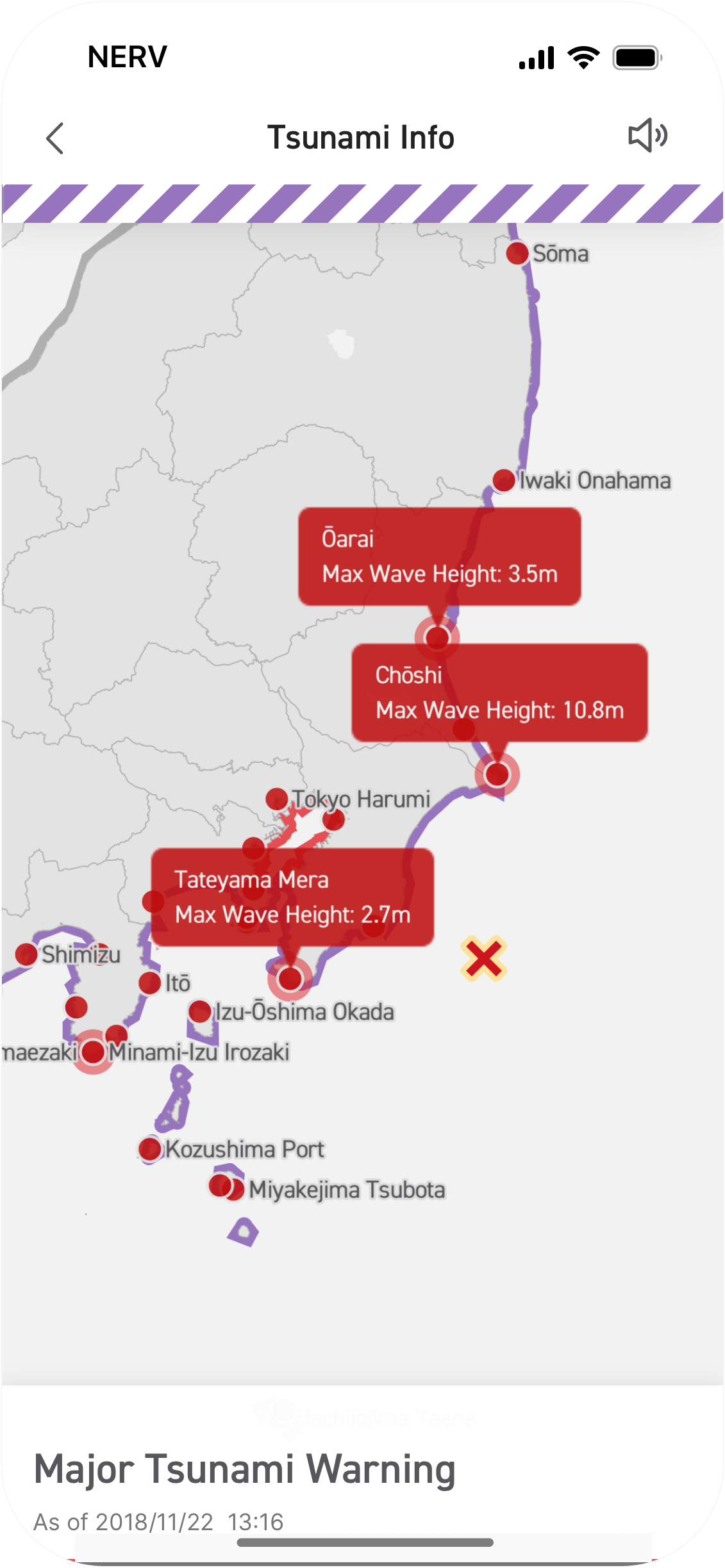
Tsunami Warnings and Advisories, local High Tide times, Expected Tsunami Arrival times, Tsunami Observation data, and Offshore Tsunami Observation data are all integrated automatically and displayed richly with a manipulatable and interactive map.
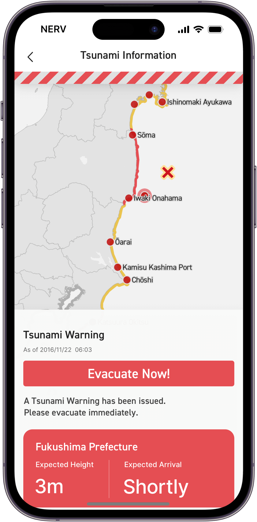
Tsunami Warning
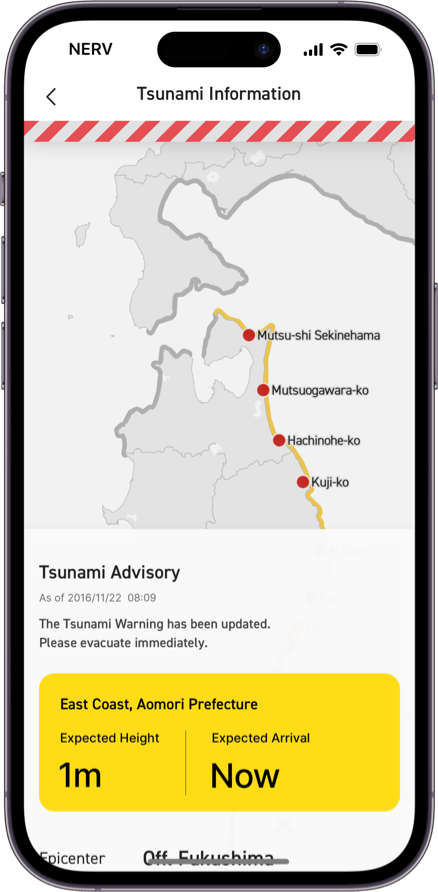
Tsunami Advisory
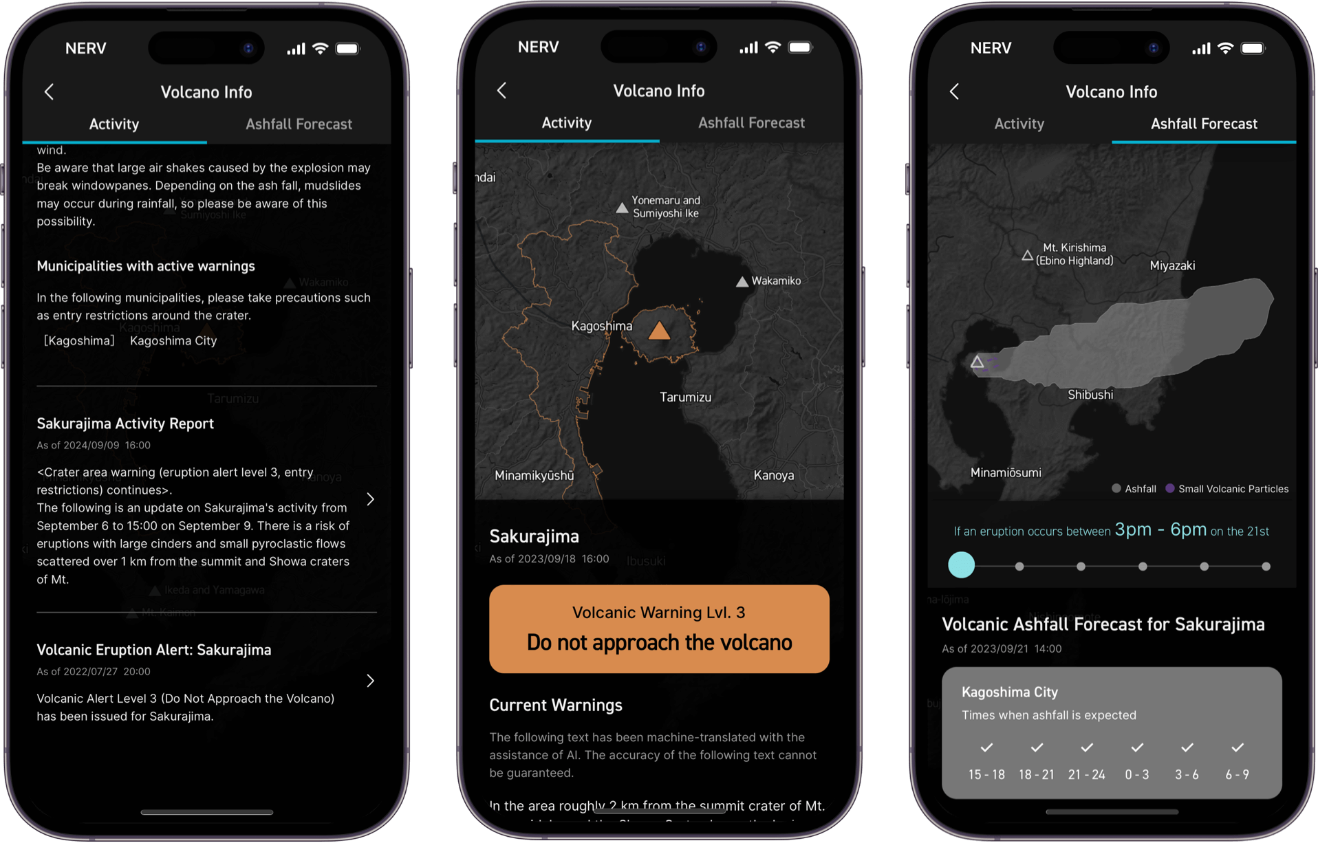
Volcanic Eruption Warnings and Advisories, Volcanic Eruption Flash Report and Ashfall Forecasts are integrated and displayed in an intuitive way that makes it easy to understand the nature of the situation at a glance.
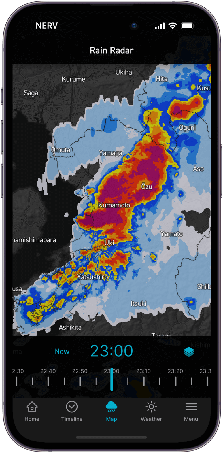
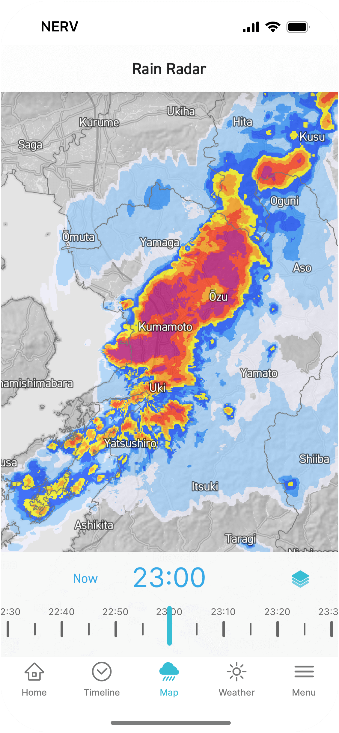
Check the rain situation with forecasts of up to 15 hours ahead and observe data up to an hour prior.
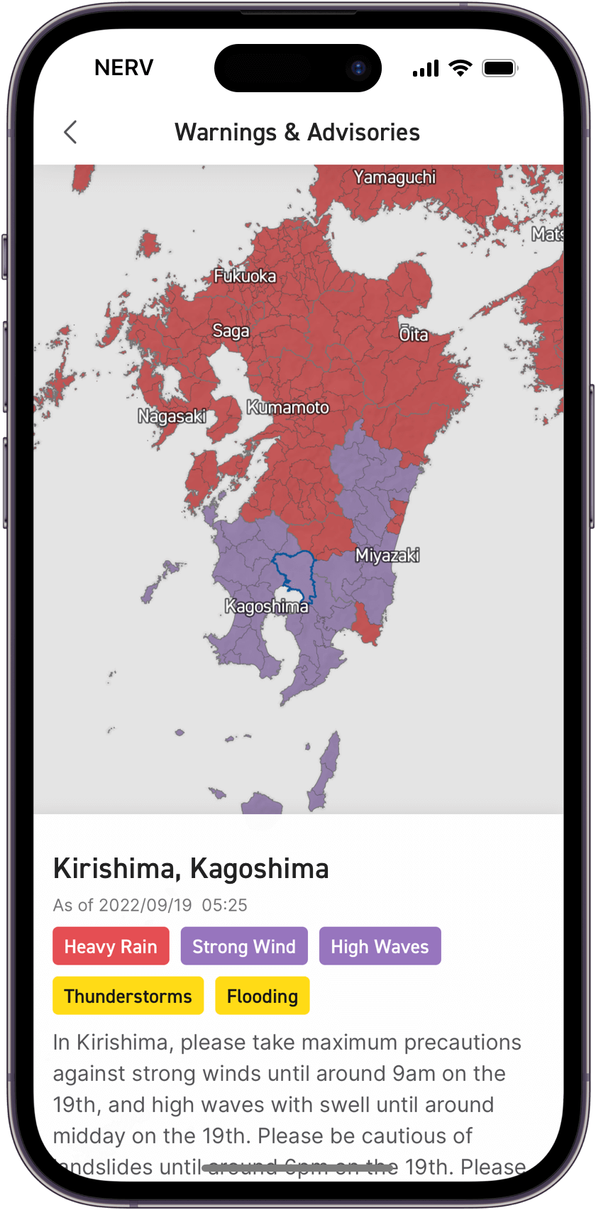
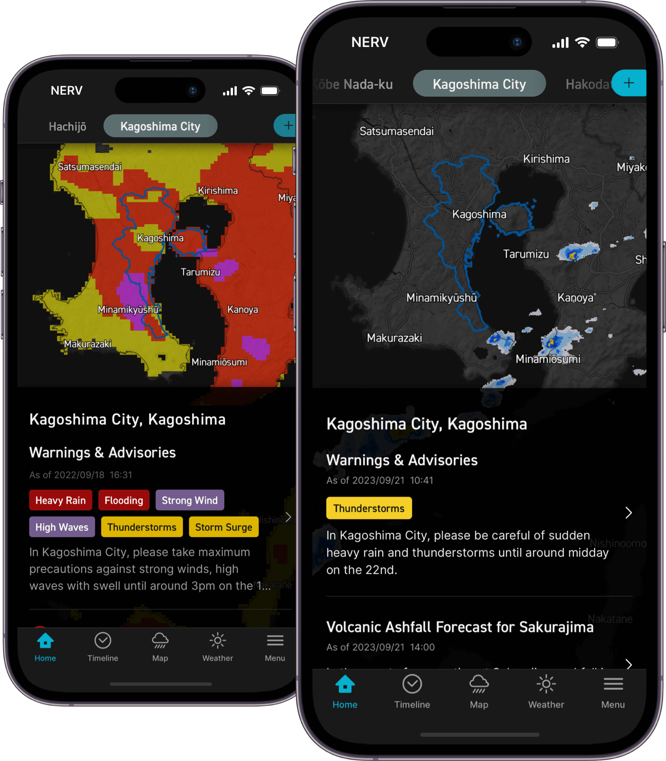
View weather warnings, advisories, and detailed information about your current and saved locations.
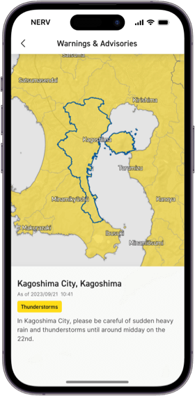
Weather Advisory
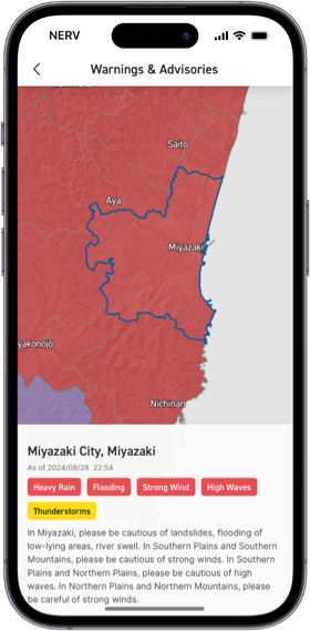
Weather Warning
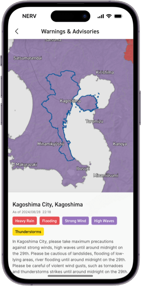
Emergency Weather Warning
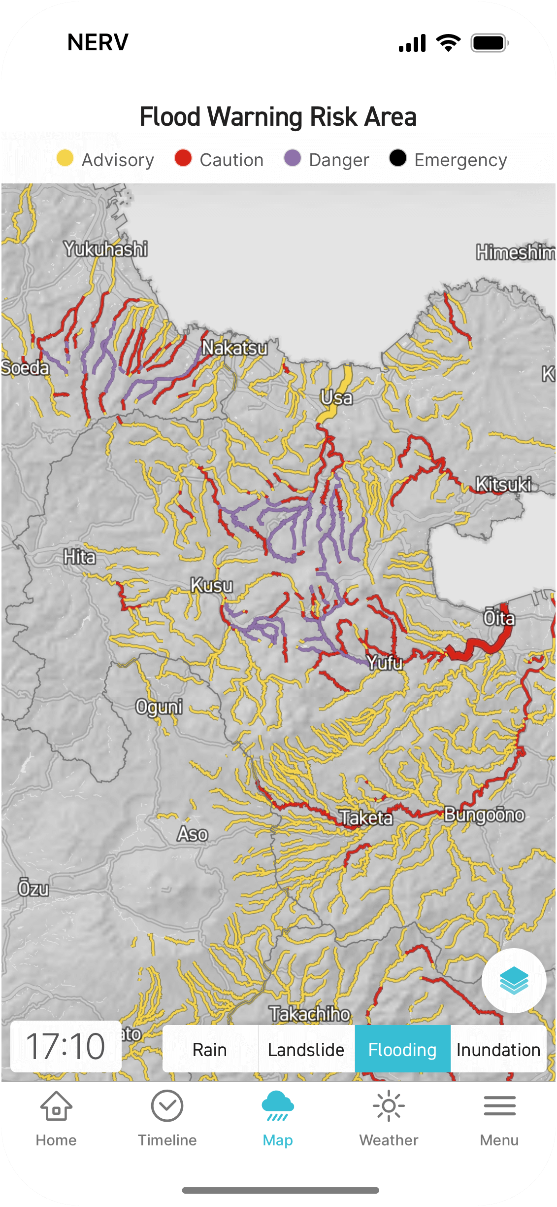
See the risk of landslides, flooding, and inundation caused by heavy rain in areas across the nation with this easy-to-understand map layer.
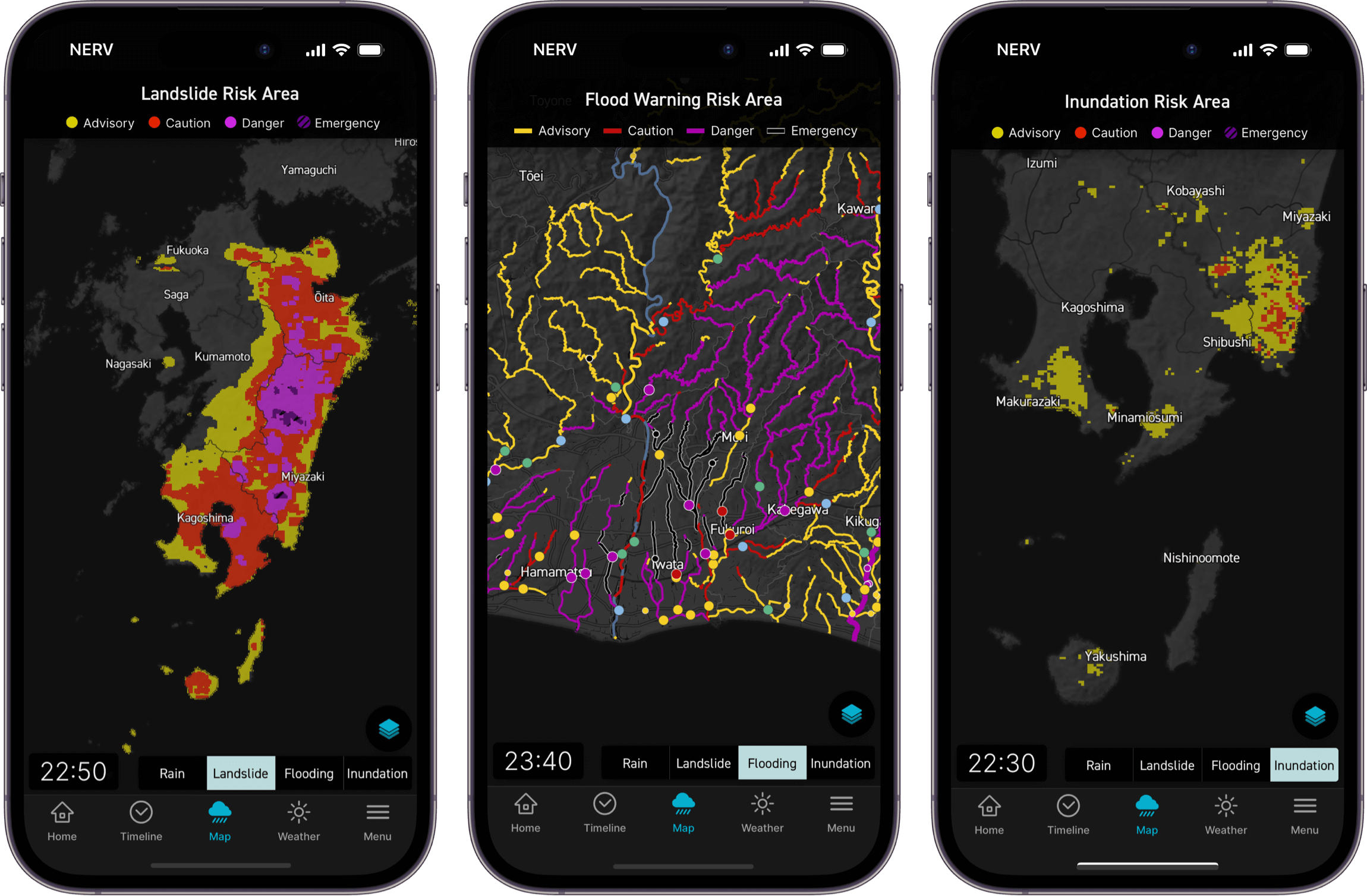
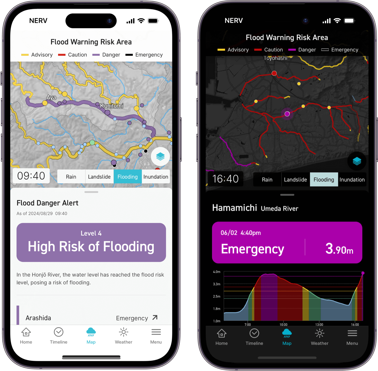
View the water levels at each river level gauge across the country as part of the Flood Risk layer from the Hazard Map. Designated river flood forecasts are also supported.
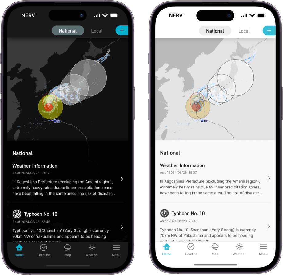
See typhoon analysis and forecast information for up to 5 days ahead, along with general typhoon information like wind speed, max gust, heading and current position in the Typhoon layer.
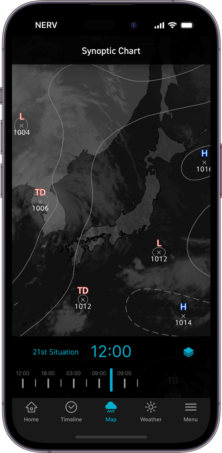
View synoptic weather charts, which display pressure systems and isobars, for up to 3 days prior in the area surrounding Japan, along with 24-hour and 48-hour forecast charts for the days ahead.
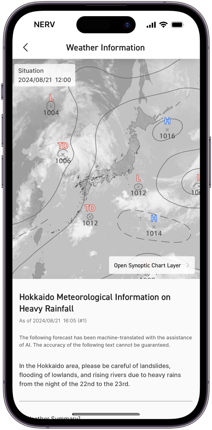
Translated with the assistance of AI, weather forecasts issued by the Japan Meteorological Agency can be viewed in English, and the weather situation is displayed in the Synoptic Chart layer integrated above.
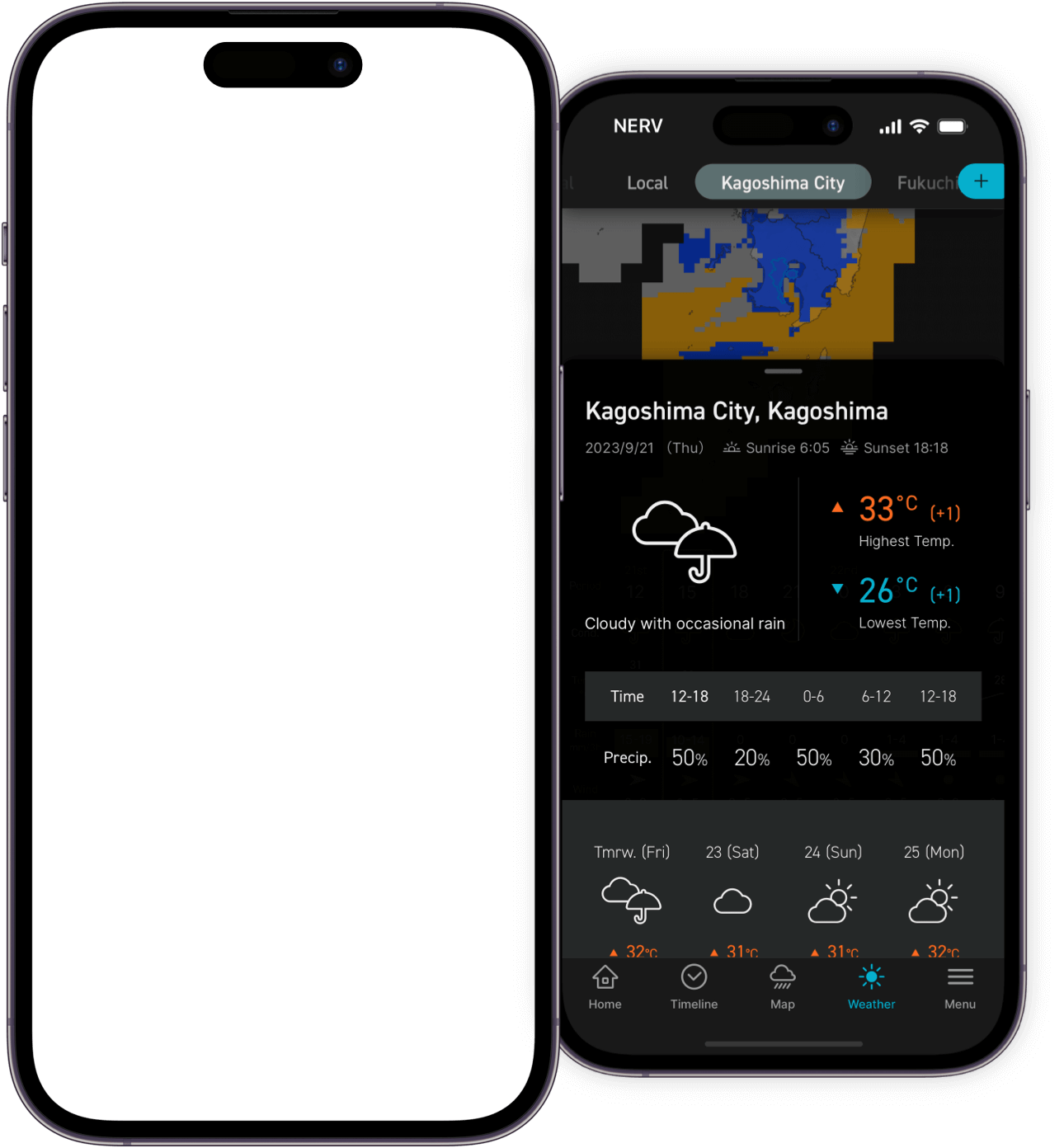
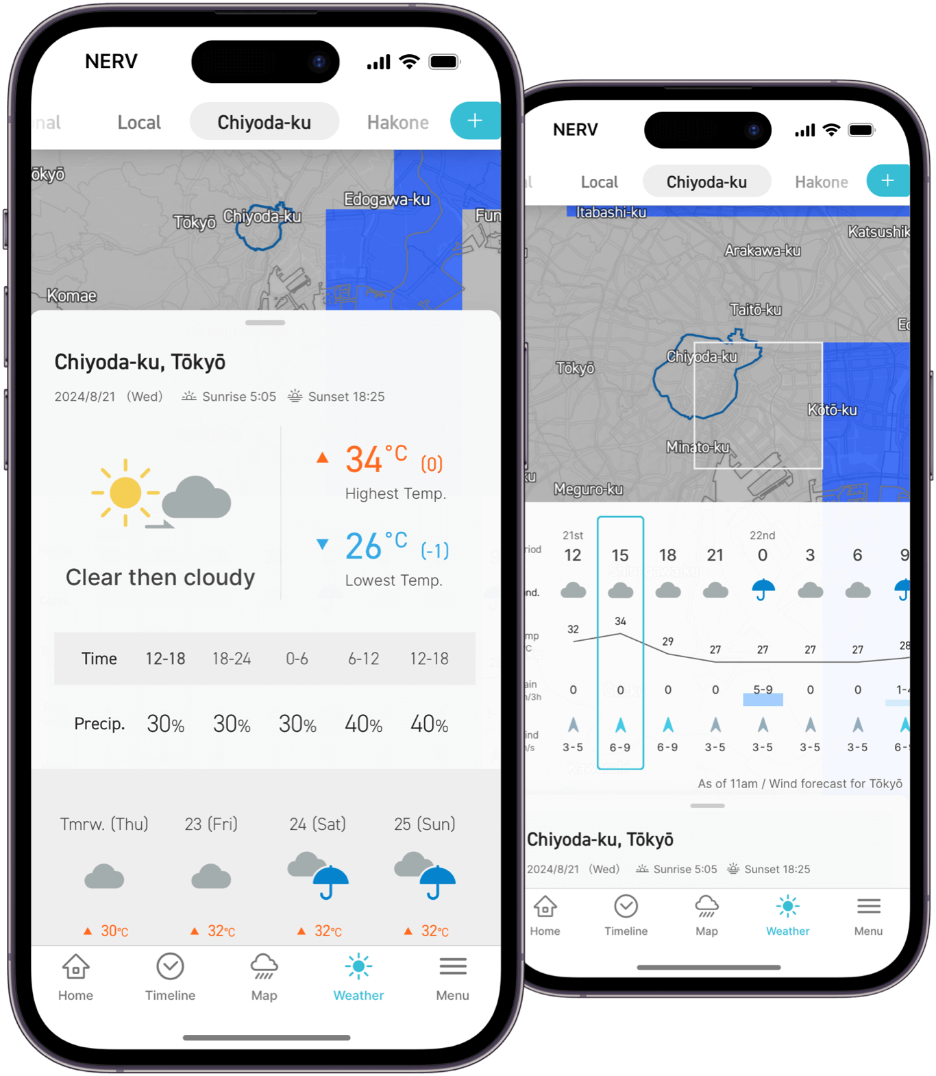
View sunrise and sunset times alongside the day's weather forecast, as well as 3-hourly and 7-day forecast information. Slide down to view the Weather Distribution Forecast layer, where you can view the weather conditions, temperature, precipitation and wind speed/direction. Scroll down on the page to view the text-based forecast and description released by the JMA of the current weather conditions, translated into English.
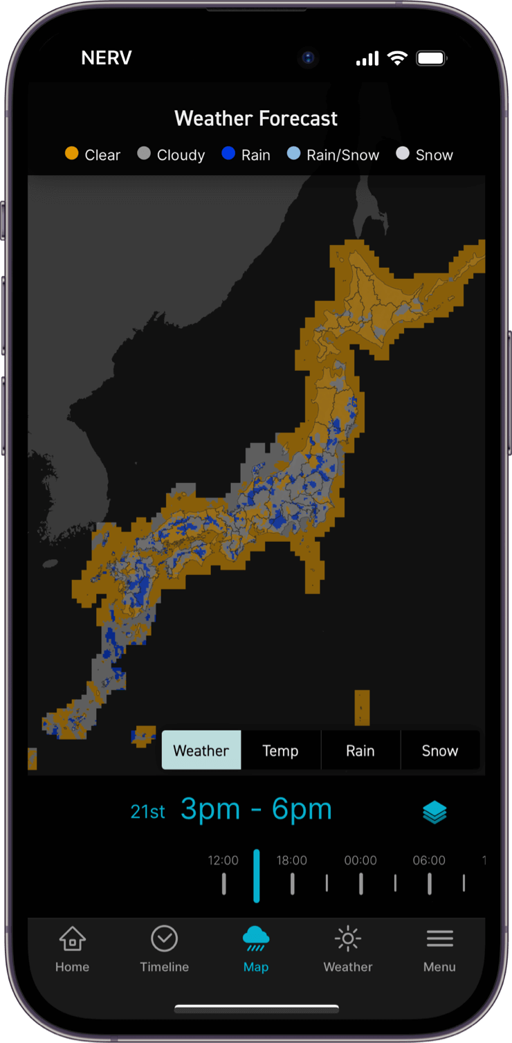
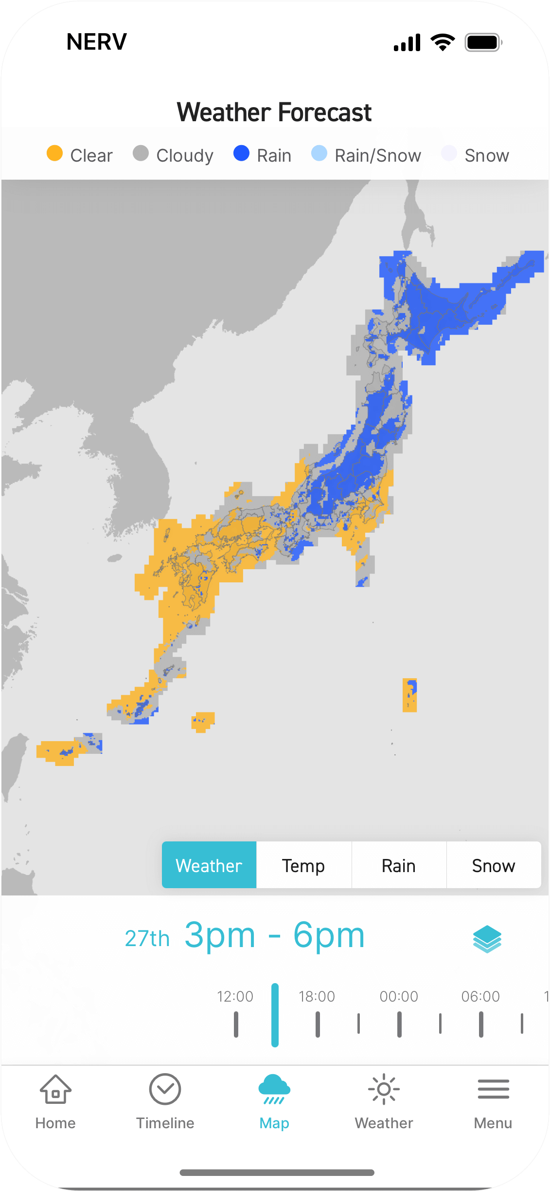
View the weather conditions, temperature, precipitation, and snowfall at a resolution of 5km on a grid until midnight of the next day. Helpful in understanding the weather situation of the whole country at a glance.
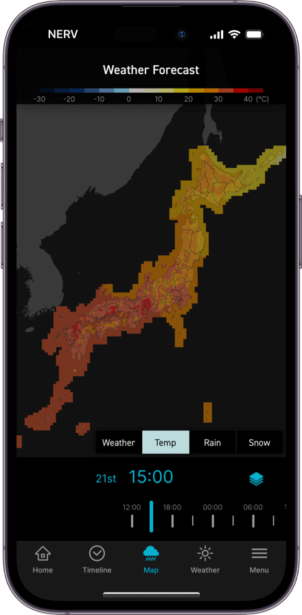
Temperature
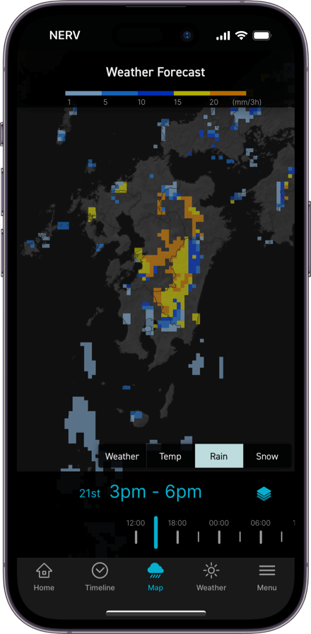
Precipitation
Real-time weather observations updated every 10 minutes of the temperature, precipitation, wind speed and snowfall at locations across the nation. Tap on an individual station to view detailed information.
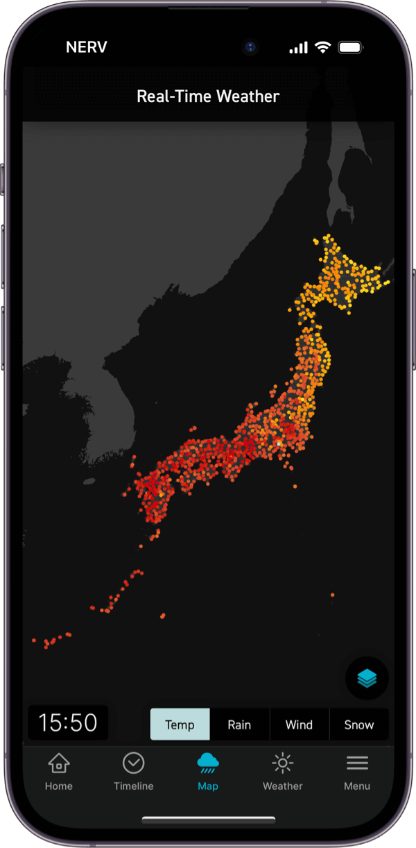
Real-Time Temperature
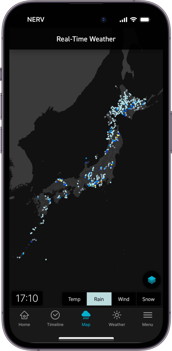
Real-Time Rain
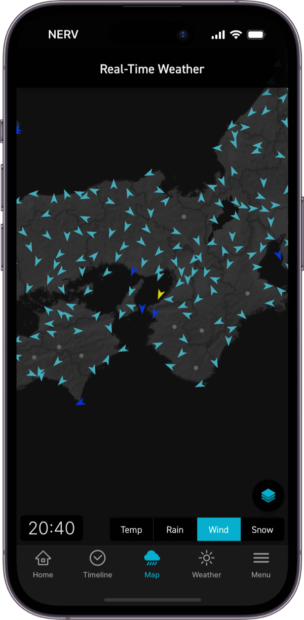
Real-Time Wind
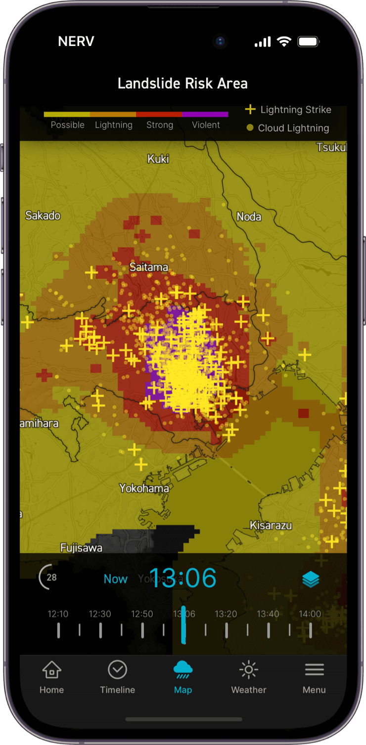
Utilising the "Thunder Nowcast" and "LIDEN" systems, you can view real-time lightning strike information (updated every minute) and lightning forecasts (updated every 10 minutes) on a map. You're also able to see cloud-to-cloud discharges in addition to ground strikes.
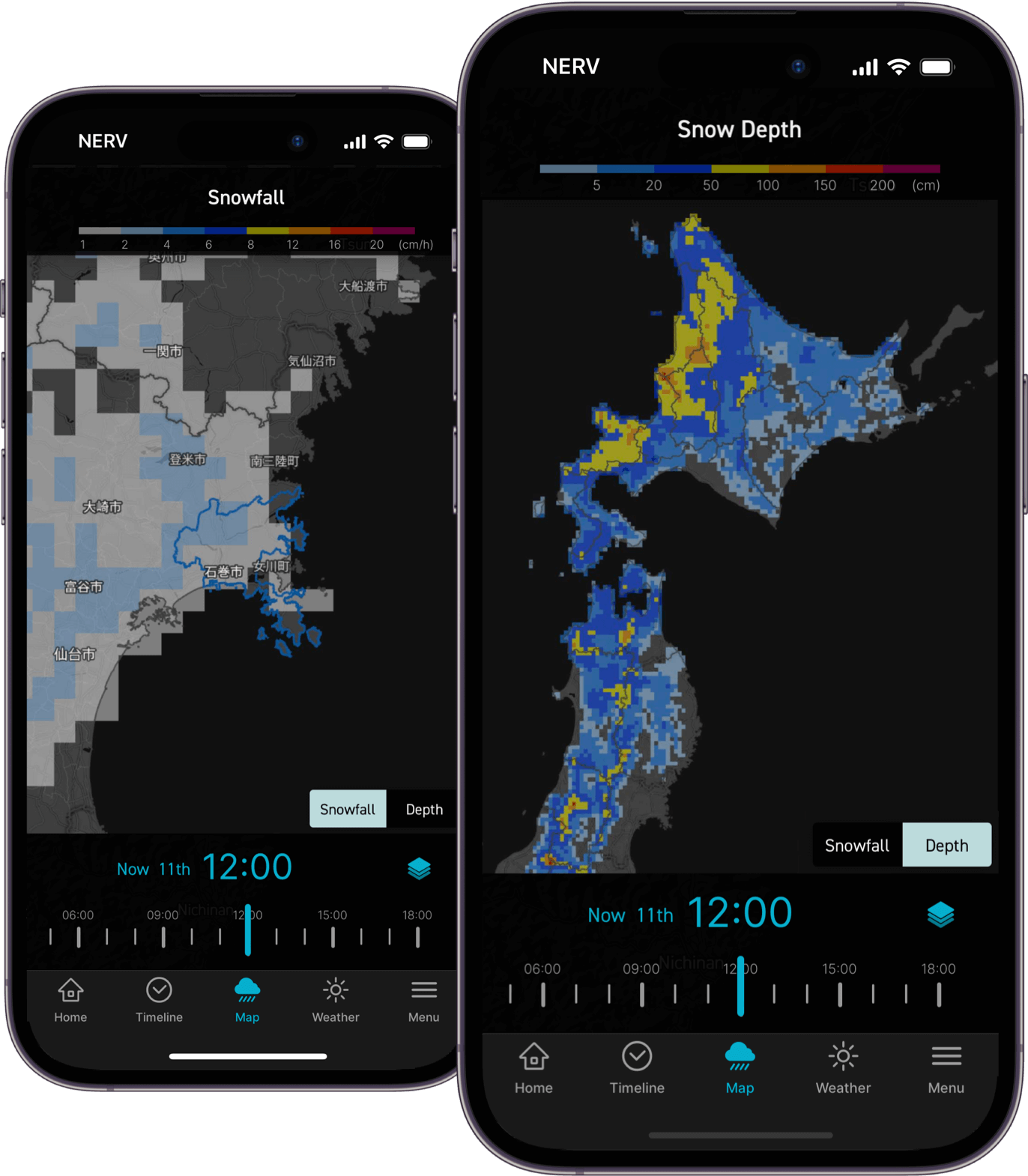
Observe estimated and forecasted snowfall amount and snow depth on a map at a 5km grid resolution, utilising "Analysed Snow Depth and Snowfall" and "Short-term Snowfall Forecast" data.
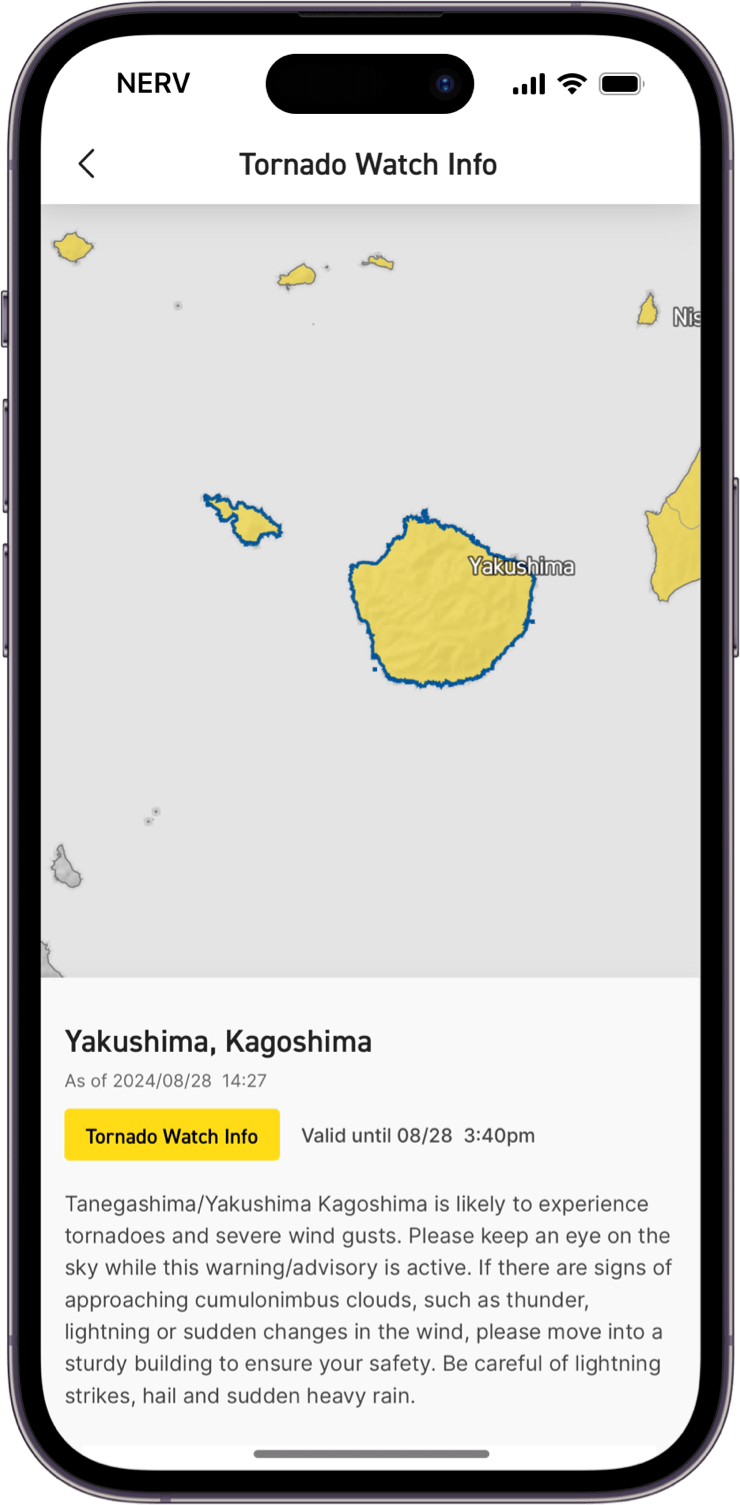
View Tornado Watch information on a map.
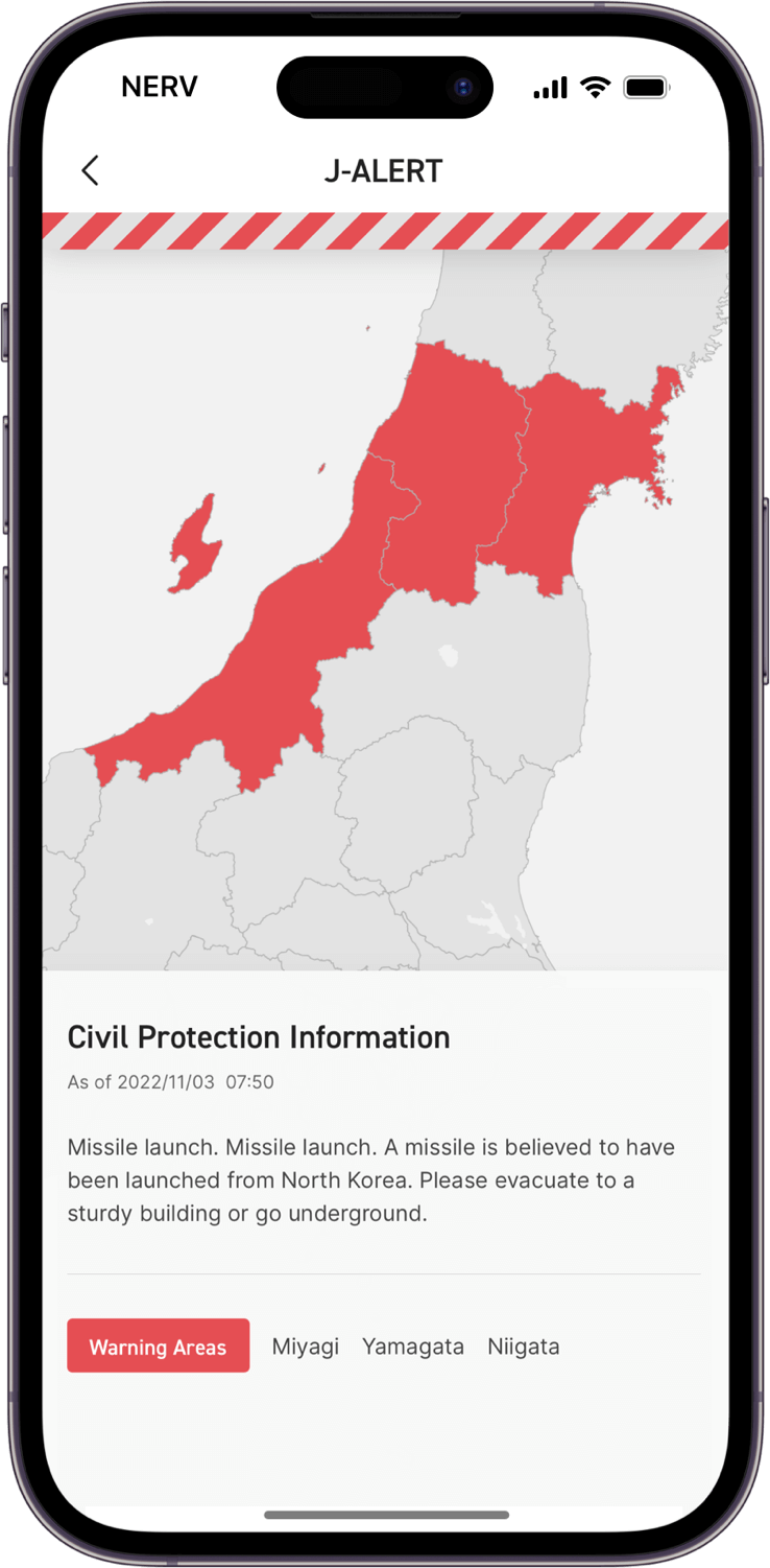
Push notifications are sent to users in relevant areas when an armed attack or terrorist threat against the public is imminent or has occurred.
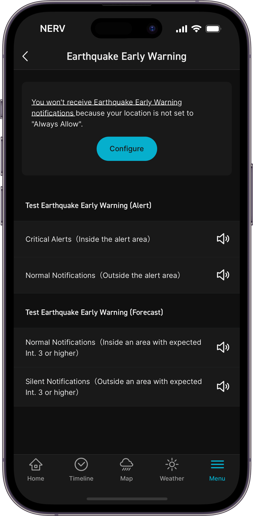
※ Location permissions must be set to "Always On" in order to receive Critical Alerts.
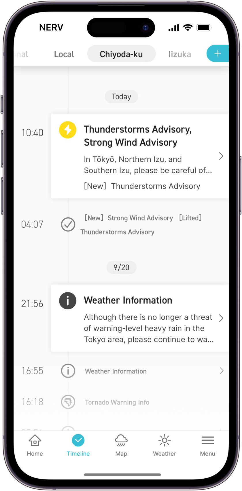
The Home screen displays and consolidates information based on time and location. When an earthquake occurs, recent earthquake information is shown on the home screen panel. Simultaneously, when weather warnings or landslide alerts are issued, the app rearranges the information according to its type, elapsed time, and urgency, allowing you to stay up-to-date with rapidly changing circumstances during a disaster.
The information panel consolidates various disaster and weather information, automatically prioritising and sorting them. Emergency weather warnings, landslide alerts and tsunami warnings are rearranged as needed. You can tap on any item displayed in the panel with a small arrow on the right to view more details.
The Timeline screen displays events from the past 72 hours in chronological order, with the newest ones at the top. You can see when weather warnings were issued and when they were lifted. When weather conditions are worsening, there may be times when weather information, tornado watch info, landslide warnings, and record-breaking short-term heavy rain information are issued quickly in succession. In such cases, you can check the Timeline screen to confirm the situation.
As with the information panel on the Home screen, a small arrow is displayed to the right of items that can be tapped on to view more details.
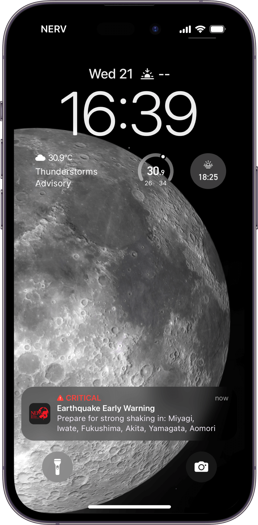
Critical Alerts, Normal Notifications, or Silent Notifications will be issued depending on the user’s location, the type of disaster information, and the level of urgency. If there is an imminent danger and the user must act quickly, like in the case of an Earthquake Early Warning or Tsunami Warning, Critical Alerts get the user’s attention by breaking through the phone’s Silent/Do Not Disturb/Focus modes and sounding at maximum volume.
※ Critical Alerts can be disabled at any time. When disabled, Critical Alerts will be treated as normal notifications.
[iOS] Settings > Notifications > Critical Alerts
[Android] Settings > Notifications > Silent Mode Exception (Android 9.0 or later).
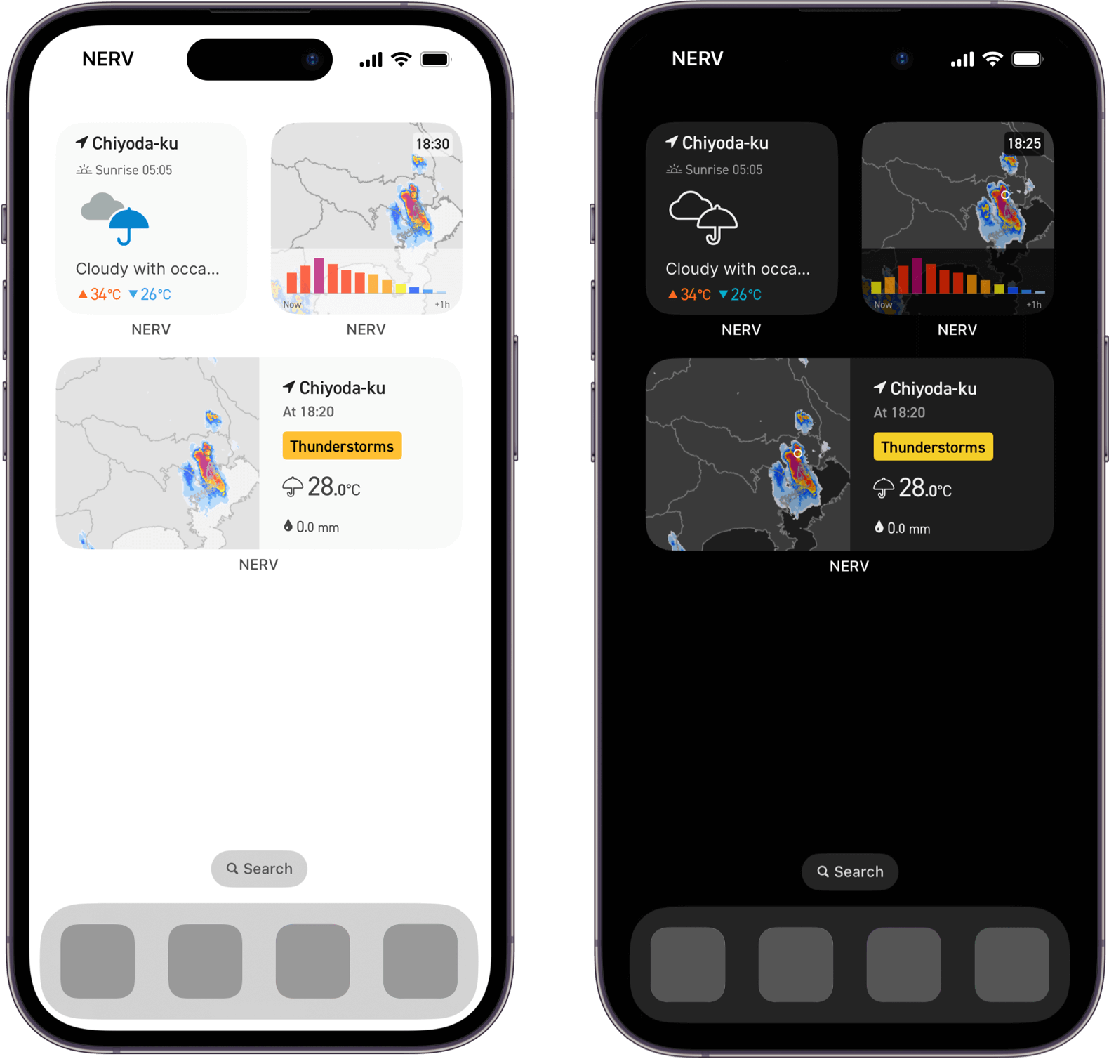
View Radar and Weather information on your home screen.
Lock screen widgets are also supported on iOS 16 and newer.
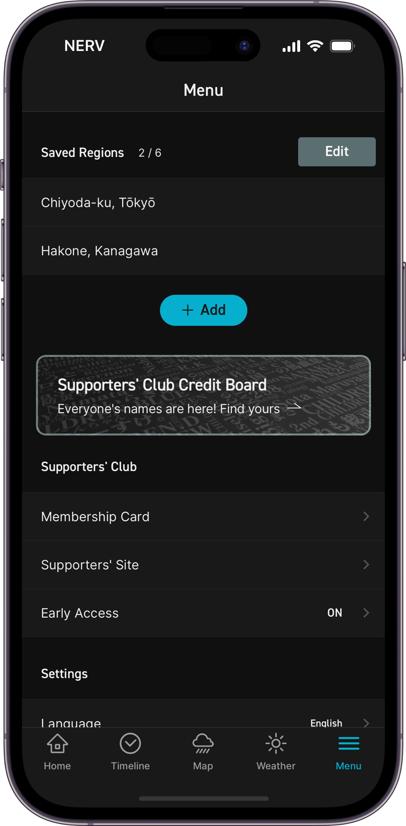
Add or remove registered areas, change languages, customise the display, and test notifications.
Please note that the areas you can register in the NERV Disaster Prevention App are not based on municipalities (administrative divisions/boundaries). Instead, they are divided into subdivisions independently set by Gehirn, the developer of the NERV Disaster Prevention App. These subdivisions are based on subdivided areas from the Japan Meteorological Agency, pre-merger administrative divisions that consider geographical features, and landslide warning zones, among other factors.
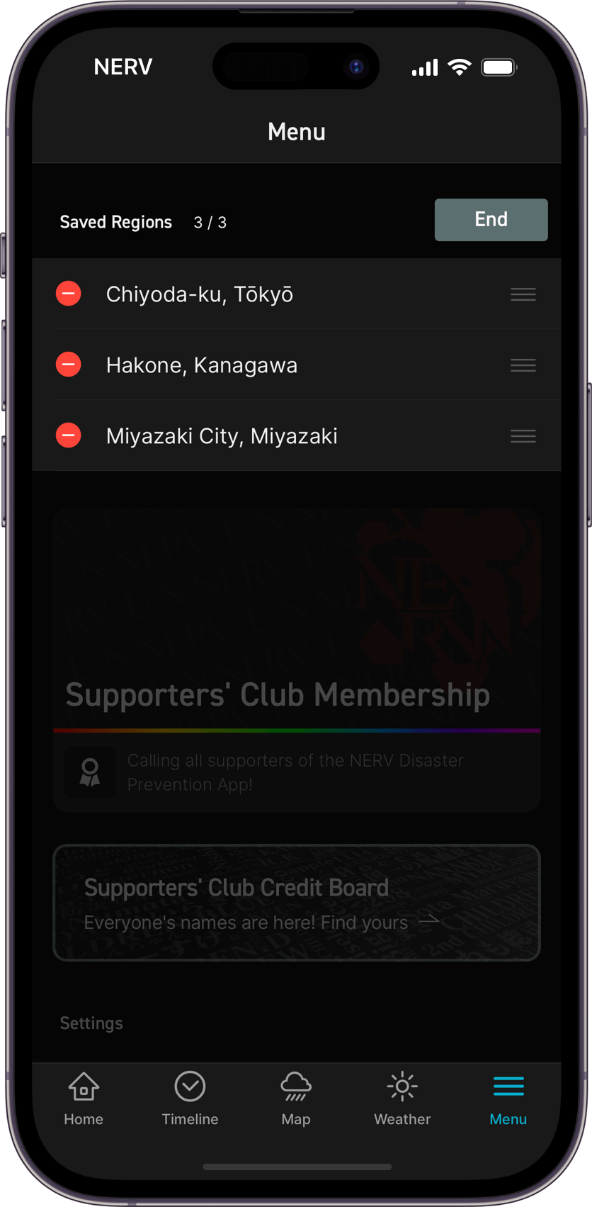
Registered Locations
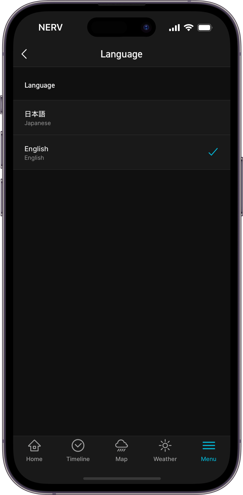
Language Settings
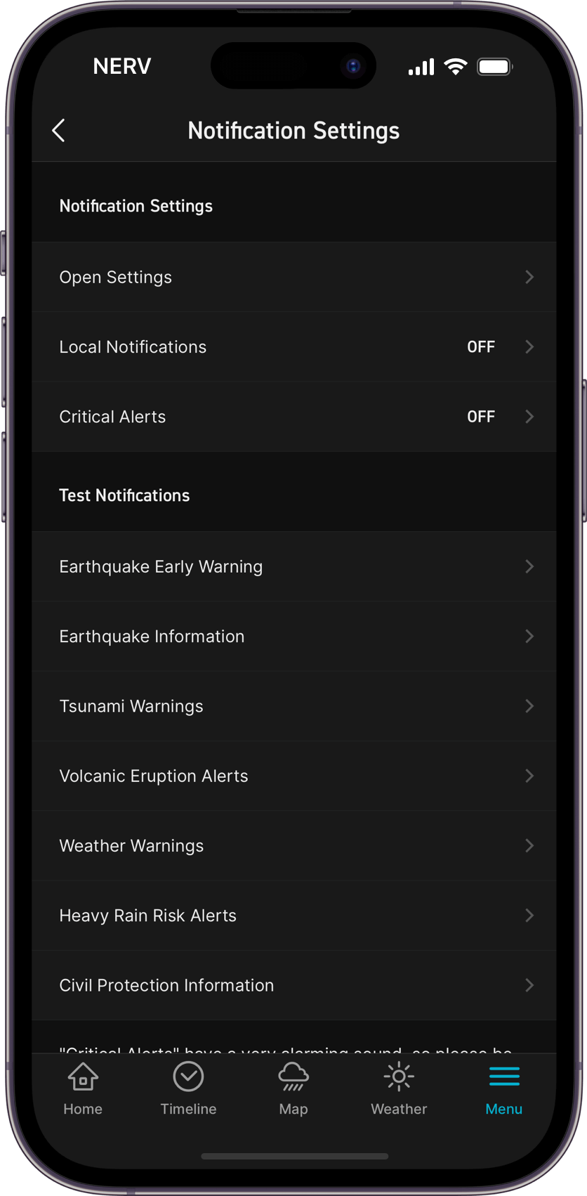
Notification Settings
Test Notifications
The FAQ page answers questions we frequently receive, as well as includes additional information on how to manage your Supporters’ Club subscription.
FAQIf your question was not answered on the FAQ page, please contact us via the Contact Us form. ※ Please note that our responses may be delayed as we’re only a small team of developers.
Contact UsAcquired location information and registered area information is used only for displaying disaster prevention information and sending push notifications. Location information sent from the application to the server is converted into an area code or mesh code in advance, within the application (client side), and only those codes are sent over the internet. In other words, the user’s detailed location coordinates never leave your device.
If the app's location setting is set to "Always Allow," the app will periodically retrieve your location in the background. This should have very little impact on your battery life. Also, when "Low Power Mode" is enabled, the app will not update your location in order to reduce power consumption.
Please use the review function on the App Store or Google Play Store for any requests or feedback regarding additional features or quality improvements. ※ Please note that we may not respond to requests submitted via the Contact Us form.